
In a world where there is an abundance of information, sometimes it can be challenging to recognize the credibility of the sources. As an international communicator, one must ensure they are telling the truth. One of the best ways to tell the truth is through data on an infographic. An infographic can display data in a way that could either be educational or persuasive. Although usually, most people should aim for the latter. The infographic is an excellent method of telling information quickly that gets to the point. The data should be simple enough to follow. Those who research international affairs would consider using the infographic as strategic communication. The scholar must keep the readers intrigued. Data that has no flavor or substance doesn’t keep the reader captivated.
An organization that tends to use the infographic in their reports is The World Economic Forum. One of the major international issues the organization keeps track of is unemployment. It becomes challenging to measure the exact number of those who are unemployed and employed. However, that is not the case for the International Monetary Fund, World Economic Outlook Database and the World Economic Forum. Recently, the World Economic Forum published an infographic that displayed the economy’s outlook in 2023. This particular infographic measures the unemployment rate for each country. Some countries do not have any data since nothing can be measured.
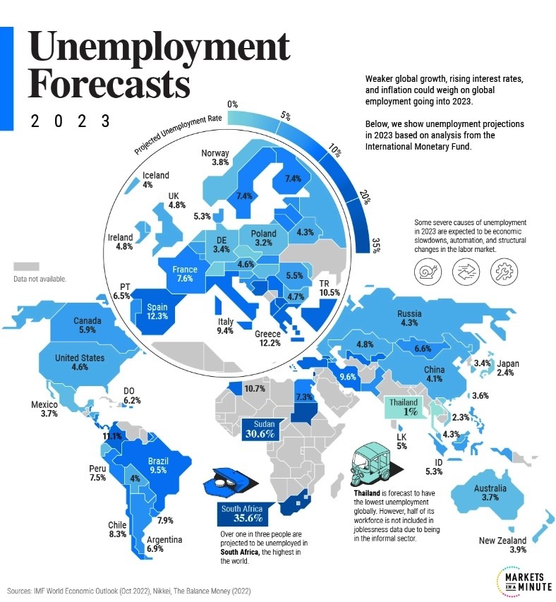
Image from World Economic Forum Website
By the looks of it, this infographic can demonstrate that the economy is doing very well in most countries. The United States is one example, with an unemployment rate of 4.6%. Japan, New Zealand and Mexico are also doing fantastic economically, as their unemployment rates have reached below 4%. Even though these countries have excellent job prospects and a vibrant economy, that doesn’t mean the unemployment is looking so bright in other countries. For example, South Africa has been dealing with a record unemployment rate of 35.6%. This is the highest unemployment rate in the world in the year 2023. Sudan is close second to this unemployment record.
To understand this high rate of unemployment in South Africa, one must know the different factors that are involved. The most obvious factor would be that it is a rough job market. In South Africa, many college grads can’t find a job despite being in school for some time. Their prospects of getting hired by someone in their field are meager. It is also essential to take into account that a lot of automation is replacing skilled laborers. Jobs that are specifically designed for people that work in manufacturing are now being replaced by machines. It’s as if the jobs that require intellectual skills are going up while the jobs involving manual labor are going down.
I enjoy this infographic because it doesn’t tell too much information to its viewers. It tells everything that one needs to know about the current unemployment rate as well as some of the potential factors that would drive unemployment through the roof. The one improvement to this infographic is that it could be more persuasive. If the creator were to use an argument about a factor that drives unemployment, I might take action against that factor.
For more information on the World Economic Forum and what is driving the unemployment in South Africa, check out the links below.

Leave a comment